Empowering Freedom
Zens
Strategy and re-brand
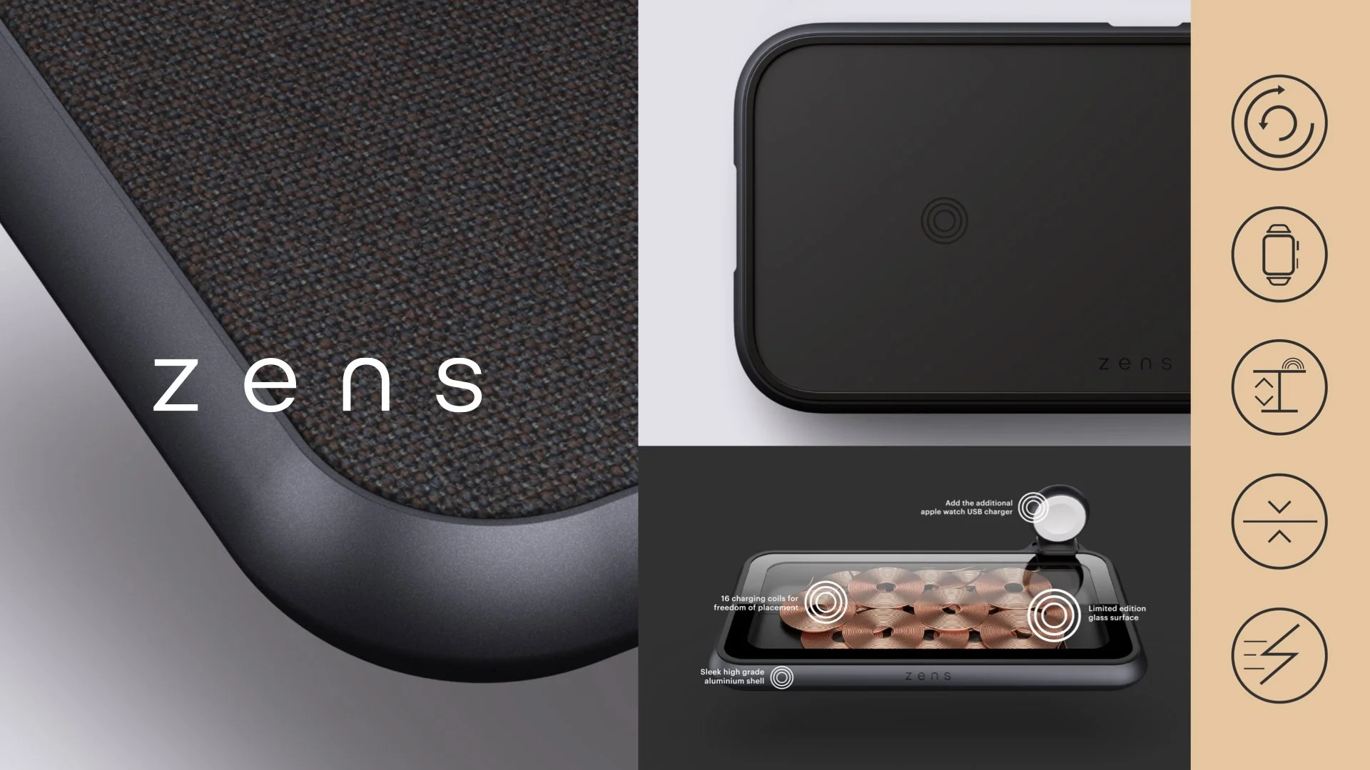
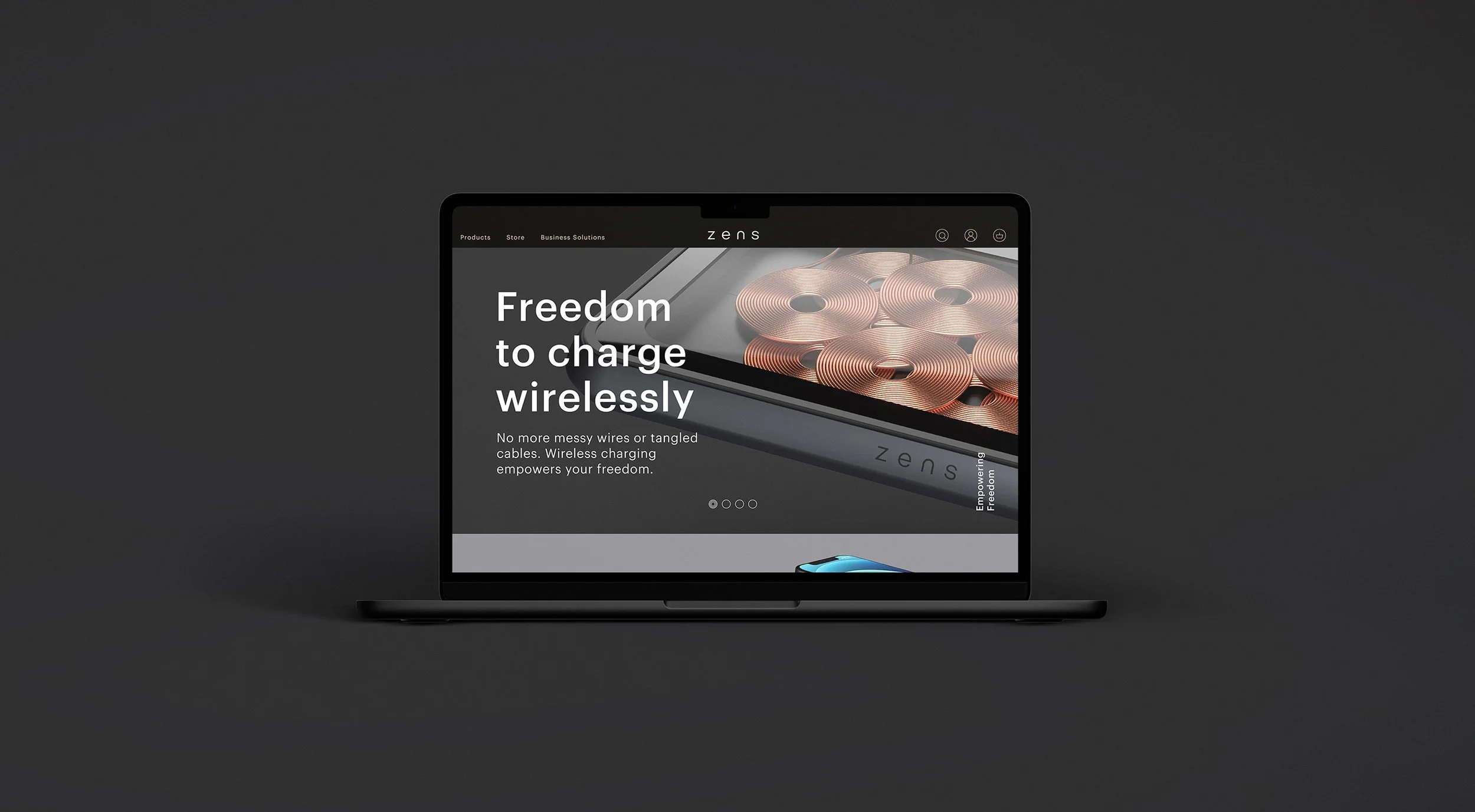
Zens are pioneers in premium wireless charging products, but their branding didn’t reflect the same aesthetic or aspiration. To take the brand to the next level of growth, we created a new strategic positioning and elevated the brand’s visual ID. Crafting a new logo, platform line, tone of voice, brand guidelines, redesigned their packaging range and created a bank of slick product imagery. The rebrand helped Zens expand its footprint and secure premium retail space in Apple stores across Europe.
A brand direction inspired by minimal product aesthetics, simplicity & ease of use.
Logo design.
The wordmark was inspired by the curved, effortless and minimal product aesthetics. Accompanied by a graphic symbol representing the philosophy of the Ensō symbol and wireless coil technology found in every Zens product.
The graphic symbol can be found on every Zens product highlighting the wireless charging connection area.
Brand & product visuals.
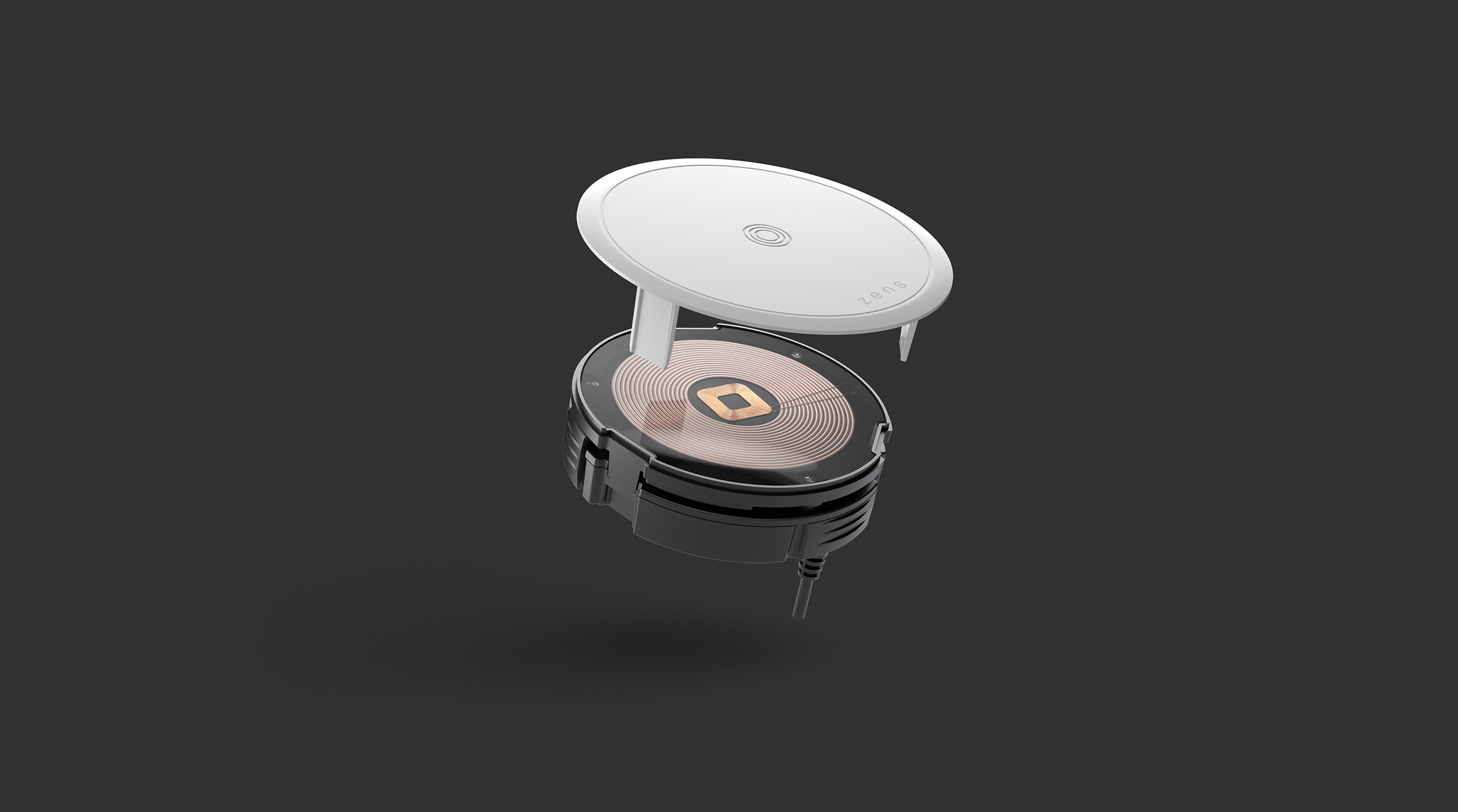
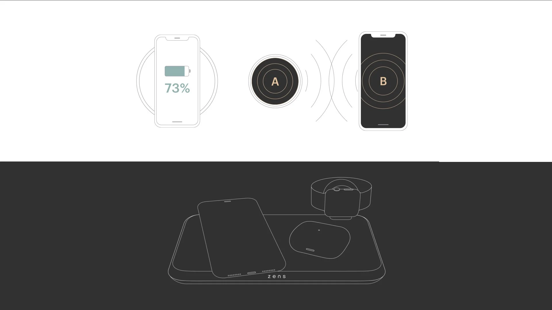
Empowering Freedom brought to life with levitating products and layered typography. Simple. Bold. Premium. With dual imagery to visual highlight the problem and solution.
Premium packaging.
Packaging portfolio for the four product series: Liberty, Modular, Aluminium & Essential. Designed to enhance the premium, tactile experience of unboxing - with copper foil on branding and overall matte finish to add to the sensorial feel of the package.


